Using small multiples is a neat way to display a lot of information in a small amount of space. But depending on how deeply you want to analyze and scrutinize the data, you need to be careful in choosing just how small you make your small multiples. Let's look at some data about the most popular jobs in the US as an example.
But first, to get you into a great mood for today's blog topic here's a cute picture from my friend Jennifer. This is her daughter holding a different kind of "small multiples" - small multiple kittens. Awww!!!

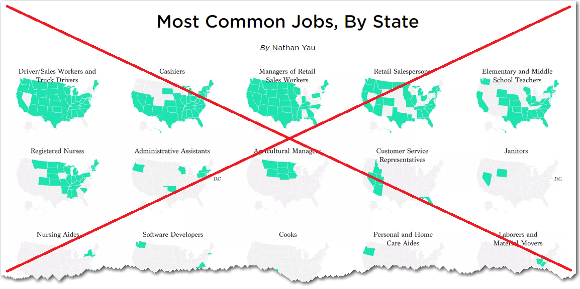
Now, let's jump into the data! Flowingdata recently posted an article about the most popular jobs in each state. They visualized the data using maps, and displayed the maps 5-across on the page. You can see many of the maps at once, all on the same page, but you can't really see much detail. In my opinion, their small multiples are a bit too small (I might even go so far as to categorize them as "tiny multiples"). Here's a screen-capture:
When it comes to data, I don't want to just see it - I want to be able to analyze it. The small multiples (above) drew me in ... but then they just left me hanging. They made me think of several questions, but didn't give me a way to answer those questions. So I decided to create my own visualization, that would allow me to analyze the data.
First I located some similar data on the Bureau of Labor Statistics website (they group and split their job categories a little differently, but I decided to roll with it). I imported the data into SAS, and did a little processing to determine the top 5 most popular jobs for each state, and also created some HTML mouse-over text tags to show the top 5 jobs when you mouse over each state. I used a by variable to loop through all the job titles, created a map for each, and arranged them two-across on the page using 'ods htmlpanel'. Here's a screen-capture (click here to see the full page of maps):
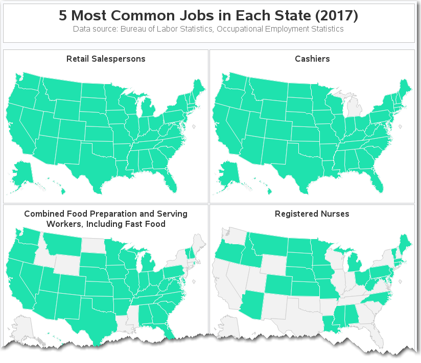
In my version, the maps are large enough to see the small states in the northeast, such as Rhode Island, that weren't really visible in the Flowingdata small multiples. My titles are also large enough to easily read, and do not overlap the map.
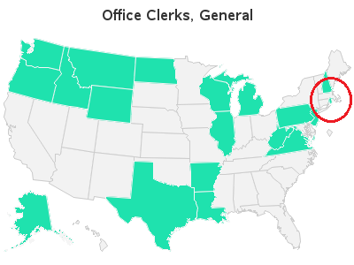
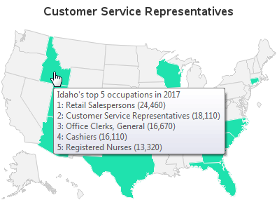
The HTML mouse-over text in my version lets you easily see all of the top 5 jobs in each state, as well as the number of employee in each of those jobs (see example below). You could also add HTML href tags, to provide drill-down capability when you click on each state, for further analysis.
Perhaps this is yet another example showing that it's best to visualize the data in multiple ways. Perhaps you could start off by looking at the 'tiny multiples' to get a general feel for the data, and then switch over to my medium-sized multiples with mouse-over text to really dig into the data.
Have you seen any examples of small multiples that were a bit too small? Feel free to post a link in the comments!